Can office colors really influence employees' mood and work? Indeed, research shows that colors have a strong impact on psychic and emotional harmony , so much so that they have given rise to a full-fledged discipline: chromotherapy.
Chromotherapy: meaning and benefits
What is chromotherapy? It is a discipline with ancient origins according to which colors are energy waves capable of acting on humans at a physical, mental, and emotional level.
All the theory surrounding it is based on the use and effects of the seven fundamental colors : red, orange, yellow, green, blue, violet, white, gray, black, and brown. These colors can stimulate various sensations and emotional states, including productivity and creativity, and are even said to foster a sense of well-being and serenity.
Since each color has its own properties , it is important to use them cleverly and intelligently. In interior design, nothing can be left to chance, and the use of one color rather than another can completely transform the work environment.
Let’s see together how to best use colors depending on the space.
Too much white and gray: mistakes to avoid
The colors most commonly used in offices, but not necessarily the best, are white and gray.
White is used as a basic, universal color, but it is not necessarily the best choice for an office. Although its energy is revitalizing and regenerative, when used extensively, this color can destabilize and create psychological insecurity. The advice is therefore to use it as a background and in combination with other colors.
Gray is another color frequently used for work environments, but its effect makes the space gloomy and the atmosphere heavy, creating a feeling that should be avoided in the office.
Instead of using these basic colors, why not opt for brighter colors? It is important, however, to pay attention to the characteristics of each color and choose the one that corresponds to the effect you want to create.
Cool colors: ideal for the relaxation area
Which colors should be chosen for the office break and relaxation area? Cool tones have the power to slow down blood pressure and breathing, thereby promoting relaxation.
Light blue , long associated with meditation, generates a relaxing effect, a sense of peace and serenity, making it perfect for the relaxation area.
Green , on the other hand, is the color symbolizing harmony, nature, and balance. It is a color that gives a strong sense of well-being and is therefore very useful for restoring mental peace during a break.
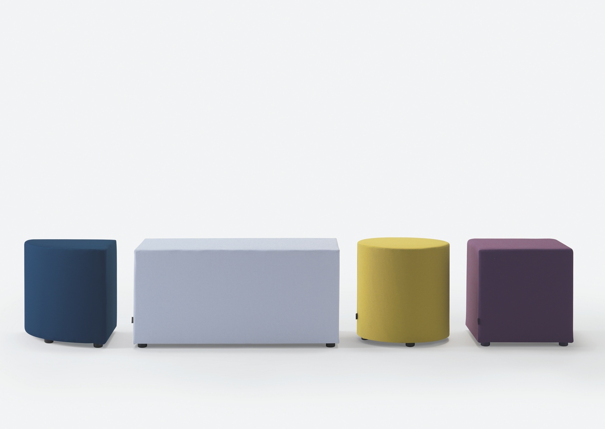
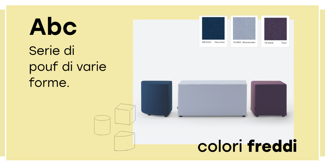
For this reason, many of our seats for the relaxation area are available in different shades of light blue and green, or generally in cool colors: for example, Abc , our series of poufs, featuring a wooden internal structure and available in various shapes, such as square, round, corner, and rectangle.
Green is also very suitable for spaces dedicated to organizing business meetings, workshops, training sessions, and seminars.
Even violet , fostering inspiration and helping to moderate irritability and impulsive states of sudden unreasonableness by slowing down heart activity, becomes a valuable ally in setting up a dedicated meeting room.
Brown: perfect for executive and presidential offices
Brown , in its shades from ochre to dark brown, is a perfect color to use for furniture or flooring in executive and presidential offices, as it represents earth and wood, evoking a sense of solidity, durability, and stability.
Brown is also associated with strong and resilient people with great patience, both qualities a leader should possess.
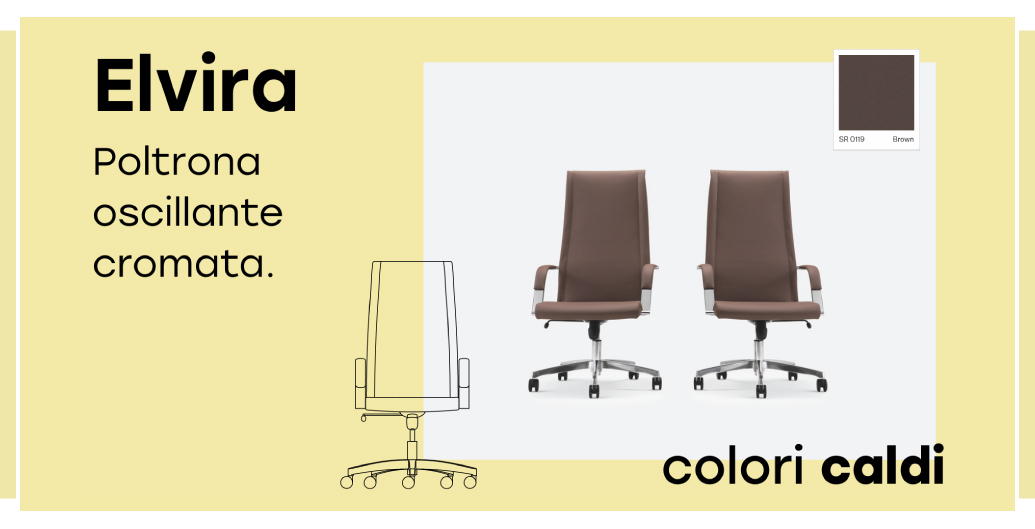
Our Elvira is the perfect example of an executive chair: its brown version adds exactly a touch of solidity and stability to the environment, without creating a heavy effect.
Warm colors for social areas, the lobby, and entrance
By accelerating blood circulation and increasing vitality, warm colors invite social interaction , conversation, and make people want to stay in the environment. They are therefore ideal for furnishing dining areas, reception areas, and entrances.
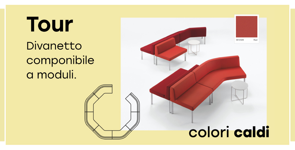
In particular, the ideal color for these spaces is red , the color of vitality par excellence, capable of communicating energy and dynamism. This color is also the perfect visual for the company image at the entrance, making it ideal for the reception.
To make an excellent impression on new clients or partners, try placing the Tour in its red version at the entrance, our comfortable modular sofa ideal for guests to wait before a meeting.
Yellow and orange for the operational area
If warm colors bring energy and vitality, one might think they are all ideal for the operational area: this is not the case!
Red, in fact, is too exciting and aggressive, and therefore not very suitable for the work area.
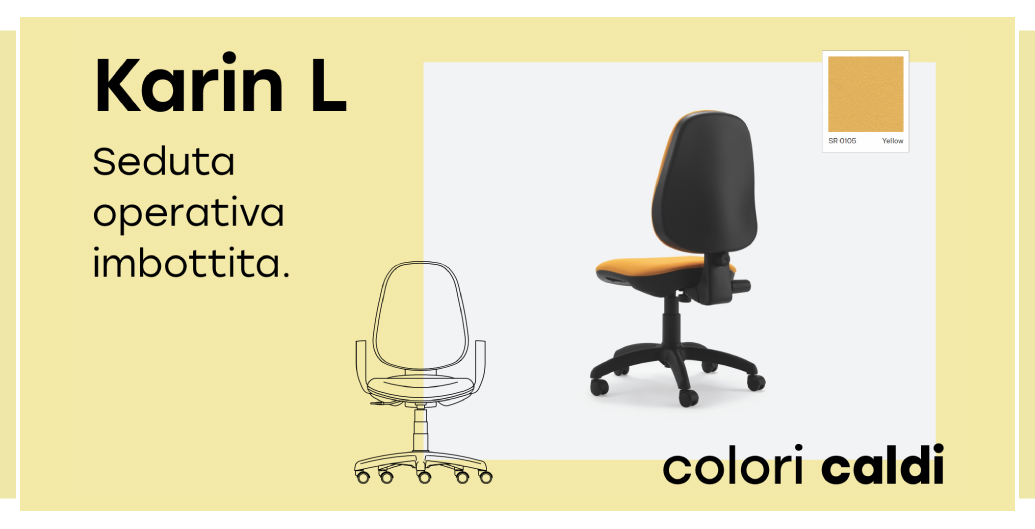
For this environment, it is better to favor yellow and orange.
Orange , with its cheerfulness, stimulates creativity and therefore becomes the most appropriate color to combat fatigue and stress in an operational area.
Yellow , moreover, is the most radiant color par excellence, capable of enhancing mental functions such as attention and learning, and even reducing drowsiness.
For this reason, among the many colors available for our office chair Karin L , these colors are also offered.
You now have all the information needed to arrange workspaces optimally: you will also make the workplace a more pleasant place to be.